
Three Patterns for Accessible Navigation Menus
Navigation menus are one of the most common components in digital media. In principle, it is a list of links that, on one hand, allows the user to navigate between the pages of the site or application and, on the other, provides them with an overview of the structure and content they can discover. However, when navigation menus contain more than one level (i.e., submenus), it takes more than a list of valid links wrapped in a <nav> tag for the component to be accessible to the user.
Since this is such a common and essential component, we could expect at least agreement in principle on the features required for its accessibility. Nevertheless, navigation menus have managed to provoke controversy and emotion when it comes to accessibility. In this post, we will look at three patterns or approaches to building accessible navigation menus.
The first pattern is the WAI-ARIA Authoring Practices’ “Navigation Menubar“, which has been criticized by some accessibility specialists and users who have even demanded adding clarifications regarding its semantic structure and usage by end-users. Next, we will look at the “Link + Disclosure Widget Navigation” by Adrian Roselli. Roselli is one of the prominent voices in the critique of the “Navigation Menubar” pattern. He introduced his pattern in response to his unheard arguments against it. We will look at the differences between the patterns and explain Roselli’s point of view, relying on his blog post “Don’t Use ARIA Menu Roles for Site Nav“. Finally, we will overview a pattern by Sarah Higley named “Disclosure for Navigation Menus“, which was also created as an alternative for the “Navigation Menubar” pattern and was later accepted by the APG as another pattern for navigation menus.
We will analyze each of the patterns from the following perspectives:
- The HTML structure, and in particular its semantics and required ARIA attributes
- Keyboard support and focus management
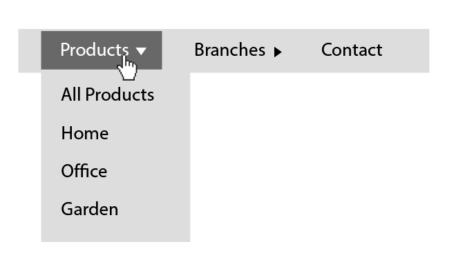
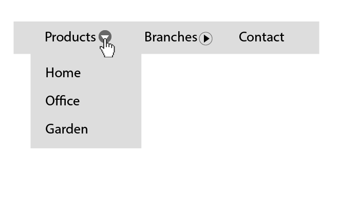
We will examine the patterns while looking at a simple navigation menu of a made-up department store that contains three items at the first level, with two of them having submenus that make up a second level. The component looks something like this, with the top items styled in a horizontal row and a second level expanded vertically on interaction:
Let’s start by examining the “Navigation Menubar” pattern from the WAI-ARIA Authoring Practices.
Navigation Menubar
Semantics And HTML Structure of the “Navigation Menubar” pattern
We will start by looking at the pattern’s HTML structure. It looks something like this:
<nav aria-label="Department Store">
  <ul id="menubar" role="menubar" aria-label="Department Store">
    <li role="none">
      <a role="menuitem"
         aria-expanded="false"
         aria-haspopup="true"
         href="#"
         tabindex="0">
        Products
      </a>
      <ul role="menu" aria-label="Products">
       <li role="none">
          <a role="menuitem" href="/path-to/products" tabindex="-1">
            All Products
          </a>
        </li>
       <li role="none">
          <a role="menuitem"
             href="/path-to/products/office"
             tabindex="-1">
            Office
          </a>
        </li>
        <li role="none">
          <a role="menuitem"
             href="/path-to/products/home"
             tabindex="-1">
            Home
          </a>
        </li>
        <li role="none">
          <a role="menuitem"
             href="/path-to/products/home"
             tabindex="-1">
            Garden
          </a>
        </li>
      </ul>
    </li>
    <li role="none">
      <a role="menuitem"
         aria-haspopup="true"
         aria-expanded="false"
         href="#"
         tabindex="-1">
        Branches
      </a>
      <ul role="menu" aria-label="Blog">
        <li role="none">
          <a role="menuitem"
             href="/path-to/branches/branch-1"
             tabindex="-1">
            Branch 1
          </a>
        </li>
        <li role="none">
          <a role="menuitem"
             href="/path-to/branches/branch-2"
             tabindex="-1">
            Branch 2
          </a>
        </li>
      </ul>
    </li>
    <li role="none">
      <a role="menuitem"
         href="/path-to/contact"
         tabindex="-1">
        Contact
      </a>
    </li>
  </ul>
</nav>
All three patterns at the component’s top-level have one thing in common, namely a <nav /> element so that assistive technologies can announce and treat it as a “navigation” element.Next, we have an unordered list element with a role=”menubar” attribute and an aria-label to identify this particular navigation area:
<ul id="menubar" role="menubar" aria-label="Department Store">
  <!-- Menu bar content -->
</ul>
Using role="menubar" may seem natural and obvious as we tend to refer to navigation menus as “menu bar” because of their appearance and layout; however, the group of “menu” roles that includes the “menubar“, “menu“, “menuitem“, “menuitemcheckbox”, and “menuitemradio” roles should represent a specific type of menu. Let’s look at the definition of the “menubar” role to clarify what it means:
“The menubar role is used to create a menu bar similar to those found in Windows, Mac, and Gnome desktop applications.“
We notice a similar requirement on the “menu” role definition:
“The menu role is appropriate when a list of menu items is presented in a manner similar to the menu on a desktop application.“
On the semantic level the “menu” and ״menubar״ roles should reflect a menu similar to that of desktop applications. This may seem like an insignificant detail, but it is the basis of criticism that Roselli and other accessibility experts have on the pattern. We will touch on this in detail in the next section, where we examine Roselli’s pattern.
On the next level, we have the list items (<li>), which has a role="none" attribute. Why is that? Well, this is due to the use of the “menu” and “menubar” roles. Let’s go back to the WAI-ARIA specifications. We can see that both “menu” and “menubar” roles require a “menuitem” or one of its derivatives (“menuitemcheckbox“, “menuitemradio“) as direct children to support the menu structure (“menubar” can also have a role=“menu” as a direct child). Since the link or button within the list item is in fact the actual menu item, we need a way to make the accessibility APIs ignore the <li>. We do this by adding them a role="none".
Now let’s look at the menu items. There are two types of menu items in this pattern. The first one triggers the appearance of a popup menu, and the second is the actual navigation link. Let’s start by examining at the first type:
  <ul id="menubar" role="menubar" aria-label="Department Store">
    <li role="none">
      <a role="menuitem"
         aria-expanded="false"
         aria-haspopup="true"
         href="#"
         tabindex="0">
        Products
      </a>
      <ul role="menu" aria-label="Products">
	    <!-- Submenu Content -->
      </ul>
    </li>
    <li role="none">
      <a role="menuitem"
         aria-haspopup="true"
         aria-expanded="false"
         href="#"
         tabindex="-1">
        Branches
      </a>
      <ul role="menu" aria-label="Blog">
        <!-- Submenu Content -->
      </ul>
    </li>
    <li role="none">
      <a role="menuitem"
         href="/path-to/contact"
         tabindex="-1">
        Contact
      </a>
    </li>
  </ul>
In this example, the <a> elements that trigger popup menus have a sibling <ul role=" menu">, which is the popup menu itself. We will get to that later, but let’s start with the anchor element’s attributes first.
As mentioned above, the anchor element has a role="menuitem" attribute as required from a direct child of “menu” and “menubar” elements. In addition to the “role” attribute, it has two attributes indicating that it triggers the appearance of a submenu. The first one is the “aria-expanded” attribute, which is more of a state indication. As the name implies, its role is to indicate to screen reader users whether the menu is expanded or collapsed, and therefore its value should change to “true” whenever the submenu is visible.
The second one is the “aria-haspopup” attribute. This attribute is also directly related to the usage of “menu” roles since it must refer only to elements with one of the following roles: menu, listbox, tree, grid, or dialog. In this case we could use one of two values, namely “menu” or “true”, which defaults to “menu”. The aria-haspopup attribute’s value should match the role of the element it triggers its appearance (e.g., aria-haspopup="listbox"). However, in the example above, I used the value “true” since it is equivalent to the “menu” value.
In reference to the menu (<ul role="menu">) element, its “aria-label” attribute has a value that matches the text of its triggering button. This is done to help screen reader users associate the button and the menu it triggers. We could allegedly achieve that by using the “aria-controls” attribute. Still, since this attribute, like the “aria-haspopup“, is poorly supported, it is common to make this association by name.The rest of the structure is pretty straightforward; the leaf <a> elements have a “menuitem” role to support the menu structure, made possible with <li role="none">. Besides that, they act as standard links. We will refer to the “tabindex” attribute in the next section, where we will discuss keyboard support.
Keyboard Support And Focus Management for the “Navigation Menubar” pattern
It is likely to assume that switching between controls (e.g., links, buttons) within a “menubar” using the keyboard, would be done by pressing the Tab key as we would with intractable elements that are not part of a “menubar“. However, the “menu” and “menubar” semantics dictate specific and non-standard keyboard support.
Let’s look at the “menu” and “menubar” roles’ definitions and what they are saying regarding the keyboard support.
Both definitions end with this sentence:
“To be keyboard accessible, authors SHOULD manage the focus of descendants for all instances of this role, as described in Managing Focus.“
This sentence teaches us that the responsibility for managing the focus within “menu” elements is on the developer, i.e., we cannot rely on tabbing and natural focus sequence. The sentence ends by referencing the “Managing Focus” section in the WAI-ARIA document for further elaboration. Jumping to the “Managing Focus” section we learn that, starting with the third paragraph and to the end of the section, there is a description of the expected focus management in “menu”, as well as a few other elements that rely on ARIA roles:
WAI-ARIA includes a number of “managing container” widgets, also known as “composite” widgets. When appropriate, the container is responsible for tracking the last descendant that was active. […]
When the container or its active descendant has focus, the user may navigate through the container by pressing additional keys, such as the arrow keys, to change the currently active descendant. Any additional presses of the main navigation key (generally the TAB key) will move out of the container to the next widget.
The “menu” roles require non-standard keyboard support, i.e., disabling the DOM’s manual tabbing sequence, and managing focus by custom scripting. That brings us back to HTML and the tabindex="-1" of the anchor elements. The “-1” value disables the manual focus by tabbing,passing responsibility to the developer to set the focus programmatically. However, since the “menubar” should mime menu bars of desktop applications, it requires keyboard support for the arrow keys using the roving tabindex technique. Below are the complete tables for supported keyboard keys for “menubar” and “menu” elements:
| Key | Function |
|---|---|
| Space, Enter | Opens submenu and moves focus to the first item in the submenu. |
| Right Arrow | – Moves focus to the next item in the menubar. – If focus is on the last item, it moves focus to the first item. |
| Left Arrow | – Moves focus to the previous item in the menubar. – If focus is on the first item, it moves the focus to the last item. |
| Down Arrow | Opens submenu and moves focus to the first item in the submenu. |
| Up Arrow | Opens submenu and moves focus to the last item in the submenu. |
| Home | Moves focus to the first item in the menubar. |
| End | Moves focus to the last item in the menubar. |
| Character | – Moves focus to the next item in the menubar having a name that starts with the typed character. – If none of the items have a name starting with the typed character, the focus does not move. |
menubar” element| Key | Function |
|---|---|
| Space, Enter | Activates menu item, causing the link to be activated. |
| Escape | – Closes submenu. – Moves focus to parent menubar item. |
| Right Arrow | – If focus is on an item with a submenu, it opens the submenu and places focus on the first item. – If focus is on an item that does not have a submenu: 1. Closes its parent submenu. 2. Moves focus to the next item in the menubar. 3. Opens submenu of newly focused menubar item, keeping focus on that parent menubar item. |
| Left Arrow | – Closes submenu and moves focus to the parent menu item. – If parent menu item is in the menubar, also: 1. moves focus to the previous item in the menubar. 2. opens submenu of newly focused menubar item, keeping focus on that parent menubar item. |
| Down Arrow | – Moves focus to the next item in the submenu. – If focus is on the last item, moves focus to the first item. |
| Up Arrow | – Moves focus to the previous item in the submenu. – If focus is on the first item, it moves the focus to the last item. |
| Home | Moves focus to the first item in the submenu. |
| End | Moves focus to the last item in the submenu. |
| Character | – Moves focus to the next item having a name that starts with the typed character. – If none of the items have a name starting with the typed character, the focus does not move. |
menu” element (the submenus)(Taken from the Navigation Menubar Example page)
We can conclude by saying that the “Navigation Menubar” pattern is somewhat complicated. Its complexity stems mainly from the choice to use the “menu” roles’ semantics, which is particularly opinionated both in the HTML level and in terms of the programmatic intervention in focus management it requires. Whether this opinion contributes to or harms the user experience and accessibility as stated, is in dispute. To understand the opponents of using “menu” roles, let’s move on to examine Roselli’s “Link + Disclosure Widget Navigation” pattern and his claims about the issues in the “Navigation Menubar” pattern.
Link + Disclosure Widget Navigation
In October 2017, Adrian Roselli published a post in his blog titled “Don’t Use ARIA Menu Roles for Site Nav“. He published this after he filed an issue against the ARIA Practices document earlier that year, demanding to add clarifications to the “Navigation Menubar” pattern regarding the meaning of “menu” semantics in a context of navigation components, which was rejected. However, only a year and a half later, Roselli published his own proposal for a navigation component in a blog post that carries the pattern’s name. Although Roselli is by no means the only critic of the “Navigation Menubar”, the amount of material he has published on the subject provides us with a holistic perspective on his perceptions.
Before we jump in to look at Roseli’s pattern, I want to draw your attention to the one significant difference. Here the items on the first level of the menu are links. Next to it, standing separately, is the icon button that is responsible for toggling the submenu if it exists. I’ll refer to this choice in some more detail towards the end of this post.
Semantics And HTML Structure of the Link + Disclosure Widget Pattern
The HTML structure of Roselli’s pattern looks like this:
<nav id="Nav">
<ul>
<li>
<a href="/path-to/products" id="item01" aria-current="page">
    Products
</a>
<button type="button"
id="btnItem01"
aria-controls="subItem01"
aria-expanded="false"
aria-label="Show"
aria-labelledby="btnItem01 item01"
onclick="toggleSubNav(this.id);">
<svg xmlns="http://www.w3.org/2000/svg""
viewBox="0 0 80 80"
focusable="false">
<path d="M70.3 13.8L40 66.3 9.7 13.8z"></path>
</svg>
</button>
<ul id="subItem01"
style="display:none;">
<li>
<a href="/path-to/products/office">Office</a>
</li>
<li>
<a href="/path-to/products/home">Home</a>
</li>
<li>
<a href="/path-to/products/garden">Garden</a>
</li>
</ul>
</li>
<li>
<a href="/path-to/branches" id="item02">Branches</a>
<button type="button"
id="btnItem02"
aria-controls="subItem02"
aria-expanded="false"
aria-label="Show"
aria-labelledby="btnItem02 item02"
onclick="toggleSubNav(this.id);">
<svg xmlns="http://www.w3.org/2000/svg""
viewBox="0 0 80 80"
focusable="false">
<path d="M70.3 13.8L40 66.3 9.7 13.8z"></path>
</svg>
</button>
<ul id="subItem02" style="display:none;">
<li>
<a href="/path-to/branches/branch-1">Branch 1</a>
</li>
<li>
<a href="/path-to/branches/branch-2">Branch 2</a>
</li>
</ul>
</li>
<li>
<a href="/path-to/contact" id="item03">Contact</a>
</li>
</ul>
</nav>Looking at Roselli’s pattern, you can see that, in terms of the basic HTML structure, it is very similar to the ״Navigation Menubar” pattern. A <nav> element wraps the entire component, and the nested unordered lists of links represent each component’s levels. However, while the basic structure is somewhat similar, the semantics are entirely different. As briefly mentioned earlier, Roselli’s critique of the “Navigation Menubar” pattern was around the use of “menu” roles that he claims not only do not contribute to the accessibility of the component, but can even harm it.
In terms of the semantics, he claims (and we saw this in the “menubar” role definition at the top) that the semantics of the menu roles match menus of complex web apps like Google Docs, for example, but are less suited to represent site navigation.
Roselli argues that, not only is this complexity unnecessary, it is also dangerous. As we saw earlier in the context of the “Navigation Menubar”, the “menu” roles require a concrete HTML structure and attributes. While browsers are relatively tolerant of the HTML structure’s validity, assistive technologies, such as screen readers, will fail to mediate the UI to the user accurately, or at all, if, for example, a “role” or other ARIA attribute is applied to the wrong element. By waiving the use of ״menu״ roles, we reduce the risk of incorrect use of ARIA attributes, making the UI unusable to the very users we are trying to support. Let’s see how this is reflected in the HTML code.
The first difference is that now the top-level <ul> element doesn’t have the role="menubar" attribute. Let’s now look at its list items and their content.
<li>
<a href="/path-to/products"
id="item01"
aria-current="page">
Products
</a>
<button type="button"
id="btnItem01"
aria-controls="SubItem01"
aria-expanded="false"
aria-label="Show"
aria-labelledby="btnItem01 item01"
onclick="toggleSubNav(this.id);">
<svg xmlns="http://www.w3.org/2000/svg""
viewBox="0 0 80 80"
focusable="false">
<path d="M70.3 13.8L40 66.3 9.7 13.8z"></path>
</svg>
</button>
<ul id="SubItem01"
style="display:none;">
<!-- Submenu Content -->
</ul>
</li> At the next level, the <li> elements now do not require a role="none" attribute, since they are no longer bound to the structural constraints of the “menu” roles. Respectively, the role="menu" and role="menuitem" are no longer required for the submenus (i.e., the nesting <ul> elements) and the anchor tags.
Before looking into the rest of the attributes, note that Roselli’s pattern is significantly different from the “Navigation Menubar” pattern in the HTML structure of the top-level controls of the component (i.e., the submenus’ toggle buttons). As opposed to the structure of “Navigation MenuBar”, Roselli separates the top-level nav elements to a link and a submenu toggle button (i.e., the disclosure widget in the pattern’s name). This structure will not work well in the context of the “menu” role. Remember, the “menu” roles require a strict semantic structure: the children of “menu” and “menubar” are constrained to be either “menu” or “menuitem” elements. So in this structure, both the link and the “disclosure widget” (activated via a toggle button) would need role="menuitem" to satisfy the structural requirements for role="menu". The duplication of menu items with somewhat similar names, which serve different purposes of the same subject, can produce a confusing user experience, mainly for screen reader users.
We will discuss this choice of structure and its meaning in more detail in the last section of this post.
Now, on each nav item with a submenu, there are two elements: the link and the button responsible for toggling the submenu. Let’s see which attributes each of them requires. We will start with the <a> elements.
<a href="/path-to/products" id="item01" aria-current="page">
Products
</a>One attribute on the <a> elements of Roselli’s pattern that’s worth looking at, is the “aria-current“. This state attribute indicates when an element within a set of related elements is the current item in the set. Note that “aria-current” has a specific list of allowed values. If it is assigned with a value outside this list, it will fall back to “true“, and screen readers will read it as “current item“. If it is assigned with an empty string, “false” or “undefined”, screen readers will ignore it. In the context of a navigation component as we have here, it is appropriate to use the value “page“.
Now let’s look at the <button> toggle element, i.e., the disclosure widget, which has quite a few ARIA attributes. We will look at them one by one.
In the context of the “Navigation Menubar” pattern, we have discussed a technique to associate a menu button with the menu it triggers. It is done by using a similar name for the control and the menu element so that the user can logically associate them with each other. Roselli chooses a different approach and uses the “aria-controls” attribute, which is assigned with the id attribute of the controlled element. However, while this is allegedly a perfectly valid approach, it has one significant flaw, and that is that there is only one screen reader that supports the “aria-controls” attribute, JAWS, which, according to WebAIM’s latest Screen Reader User Survey, covers approximately 40.1% of the users. Therefore, most users will not benefit from it at all.
Moving forward, we can find the “aria-expanded” attribute, which we’ve discussed in the context of the “Navigation Menubar” pattern. Note that Roselli is not using “aria-haspopup“, since it is reserved for composite roles such as “menu” and “listbox“.
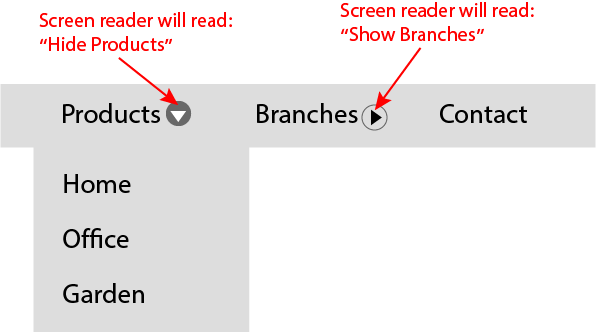
The last thing that I would like to discuss regarding this button is its naming method. Since it does not contain any text node to provide it with an accessible name, Roselli uses the “aria-label” and “aria-labelledby” attributes. Why does the button require both? Moreover, we can see that one of the ids assigned to the “aria-labelledby” attribute is the button’s id; hence it’s labeling itself. So how does it work? The “aria-labelledby” can combine an accessible name from a few different sources, so, for example, a screen reader will read the button on the component’s first item by default as “Show Products“. However, the value of the button’s “aria-label“, in this case, is being updated from “Show” to “Hide” and vice versa via Javascript whenever the submenu’s state changes, so when the submenu is expanded, a screen reader will read the button’s name as “Hide Products“.
After we reviewed the semantics and structure of Roselli’s pattern, let’s now look at its keyboard support requirements.
Keyboard Support And Focus Management for the Link + Disclosure Widget Pattern
Keyboard support for this pattern is pretty straightforward. First, note that the controls here do not have a tabindex="-1". In the “Navigation Menubar” pattern, we need them to manage the focus programmatically due to the requirements of the “menu” roles. In contrast to the “Navigation Menubar” pattern, Roselli’s pattern does not require programmatic focus management. In terms of focus management, this pattern solely relies on the DOM’s default focus sequence, so we should make sure that all the controls can be focused by manual tabbing and that nothing blocks it (like tabindex="-1", for example).The only key that Roselli specifically adds support to is the “Escape” key. Pressing it collapses any expanded submenu.
| Key | Function |
|---|---|
| Escape | Closes submenu |
To summarize this section, we have seen how the semantic definitions affect the structure of the component, its requirements, and constraints, and directly affect how the end-user will use the component and the user experience. We could also learn that, even among the accessibility specialists, there is no agreement on the ideal navigation menu in terms of accessibility. What’s more, if you read Roselli’s post, you will see that the subject even elicits honest, emotional reactions.
In this spirit, we will move on to discuss the third and final pattern in this post. We will, however, not review it as thoroughly as the previous patterns discussed, but I bring it here because I believe that it, to some extent, combines some of the better features from each of the patterns we have reviewed so far.
Disclosure for Navigation Menus
I will start this section by saying that Sarah Higley’s “Disclosure for a Navigation Menu” pattern does not present a fundamentally different approach from those of the previous patterns we reviewed, particularly from Roselli’s patterns and, to some extent, also from the “Navigation Menubar” pattern. Nevertheless, I choose to refer to it since it seems that there is some consensus regarding it. In a way, it is the middle ground between the two other patterns we have reviewed earlier.
Semantics And HTML Structure of the Disclosure for a Navigation Menu pattern
In terms of semantics, Higley also avoids using the “menu” roles. Therefore, like in Roselli’s pattern, we are exempt from the constraints they present. However, in terms of the HTML, Higley’s pattern looks like a combination of the “Navigation Menubar” and the “Link + Disclosure Widget Navigation” patterns. Let’s look at the HTML.
<nav aria-label="Department Store">
    <ul class="disclosure-nav">
        <li>
            <button aria-expanded="false"
                    aria-controls="id_products_menu">
                Products
            </button>
            <ul id="id_products_menu">
                <li>
                    <a href="/path-to/products/">All Products</a>
                </li>
                <li>
                    <a href="/path-to/products/office">Office</a>
                </li>
                <li>
                    <a href="/path-to/products/home">Home</a>
                </li>
                <li>
                    <a href="/path-to/products/garden">Garden</a>
                </li>
            </ul>
        </li>
        <li>
            <button aria-expanded="false"
                    aria-controls="id_branches_menu">
                Branches
            </button>
            <ul id="id_branches_menu">
                <li>
                    <a href="/path-to/branches/">All Branches</a>
                </li>
                <li>
                    <a href="/path-to/branches/branch-1">Branch 1</a>
                </li>
                <li>
                    <a href="/path-to/branches/branch-2">Branch 2</a>
                </li>
            </ul>
        </li>
        <li>
            <a href="/path-to/contact" id="Item03">Contact</a>
        </li>
    </ul>
</nav>
As you can notice, Higley also uses an <button> element for the disclosure widget; however, the user experience is somewhat different. In Higley’s pattern, the disclosure button is not sharing its space with an <a> element, so the whole navigation item serves a single purpose. On this subject, I believe that, though it depends on the use case, the user experience from the structure that Higley presents is better and more inclusive. If product constraints allow it, I believe it will be the better approach.
In terms of ARIA attributes, the button, in this case, contains a text node that makes its “accessible name” and spares us from using the “aria-label” and “aria-labelledby” attributes.
One thing that, in my opinion, was missing in Higley’s pattern was that she gave up the “aria-current” attribute to provide screen reader users with a better orientation in the website or application. However, this shouldn’t prevent you from using it if you are implementing the pattern by yourself. In this, we also summarize the section that deals with semantics and structure. Now let’s look at the pattern keyboard support.
Keyboard Support And Focus Management for the Disclosure for a Navigation Menu pattern
The essential requirements for keyboard support in Higley’s pattern are the same as in Roselli’s pattern. However, Higley accepted the suggestion on her pull request to add support for arrow keys as well. However, since in her pattern, the semantics do not force the support for these keys, Higley left this alternative optional.
Summary
First of all, I would like to thank you for getting this far. To sum it up, in this post we have reviewed three navigation components built with an accessibility orientation. We’ve addressed the components that we had to take into account in each pattern to support their accessibility. We have seen that the semantics we choose to use may dictate a specific structure and behavior, and presented approaches from several leading accessibility experts.
I hope this post will help you choose the best and most accessible way to build your following navigation components.
Thanks for reading.
Acknowledgments
Thanks to Marcy Sutton for reviewing this post and sharing her insights.
Sources
WAI-ARIA Practices – Navigation Menubar Example
WAI-ARIA Practices – Example Disclosure for Navigation Menus