")

Meeting the WCAG Sucession Criterion Bypass Blocks (2.41)
This post is about meeting WCAG Success Criterion 2.4.1 Bypass Blocks. This criterion is required to complete accessibility conformance level A in order to improve the user experience for assistive technology users such as keyboard and screen reader users in navigating web pages and applications.
To better explain our solutions later on, let’s look at the problem first. The essential user experience of navigating web pages for users, which depends on the keyboard, is sequential on its basis. Web pages and applications often have blocks of content that repeats on more than one page. Take, for example, navigation bars, lists of social media links, and advertising frames, these can amount up to too many elements that the user has to pass one by one on every page.
The bypass blocks success criterion in its most puristic form is meant to solve this very problem. Let’s look at the exact wording of the success criterion:
A mechanism is available to bypass blocks of content that are repeated on multiple Web pages.
WCAG 2.1. 2.4.1 Bypass Blocks
As you can see, the success criterion refers to a repeated blocks of content, but in my opinion the true essence of this success criterion is manifested in the description of its intent, which starts with these words:
The intent of this Success Criterion is to allow people who navigate sequentially through content more direct access to the primary content of the Web page.
Understanding Success Criterion 2.4.1: Bypass Blocks
A sighted user has the ability to ignore the repeated content by focusing the part of the page that interests him. Mouse users have the ability to interact with elements with a single mouse click rather than encountering every other element that comes before the item they are looking for.
The bypass blocks success criterion gives keyboard users and screen reader users a satisfactory alternative for these capabilities.
In this post we will cover a few methods to use in order to meet the bypass blocks citerrion.
We will start by discussing skip-links, their role, and issues to look out for when using them. Lastly, we will see how to enable blocks’ bypassing by using semantic elements.
Skip-links
My relationship with web accessibility started a few years ago when I worked for a company that provided rich content widgets to large publishers. I was assigned to overview the products’ accessibility status and develop a plan for meeting the accessibility requirements of new regulations that just got in force.
At that time, my understanding of web accessibility amounted to the requirement of an alt text to <img /> tags, so therefore I’ve started to research the subject. One of the first terms or ideas I ran into was the skip-links. The concept of providing an internal link that allows keyboard and screen reader users to skip right to the page content, made sense to me, and it helped me to see new aspects of page accessibility and the difficulties some users experience.
Nevertheless, this is not another skip-links mechanism blog post. There are plenty of these already. This brings me to the second part of the story. A couple of years later, as part of my job for another company, I had to randomly test all sorts of websites and apps to find common accessibility issues. While doing these audits, I noticed that, although many of the websites had a skip-links mechanism, it was, in most cases, broken or only partially working. Looking further into it, I saw that the same issues with similar causes repeated themselves over and over again. So in this section, I would like to point out these common potential issues and suggest ways to avoid them as much as possible.
What Are Skip-links?
For a start, and just so we can ensure that we sync, and for the benefit of those who are less familiar with the concept, let’s start by defining what skip-links are.
Skip-links is an internal link mechanism in web documents that allows users who depend on the keyboard to bypass UI parts that repeat on all the web pages. When clicking the skip-link(s), the linked element scrolls into view, and the user is spared the need to press the tab key repeatedly until the focus is set on the element they are looking for, and it is scrolled into the viewport.
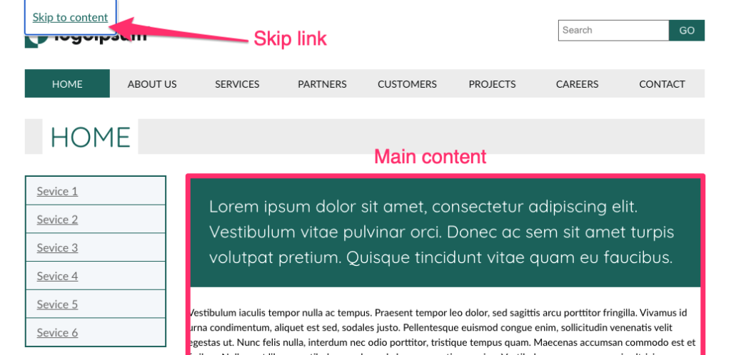
See how skip-links work. Go to the page on the link above, press the Tab key and see the skip-link appearing (there are more than one). Now press the Enter key and see the main content scrolling to the top of the viewport.
The dark side of skip-links
Skip-links is a pretty simple mechanism, and yet there are a few common pitfalls that can easily make it unusable to some or even all users.
In this section I will share what I’ve learned about the common problems of skip-links and how you can try to avoid them whilst still making skip-links relevant to all users who need them.
Broken links
I want to start this section with a disclaimer. The causes of this issue that I will present here are mere assumptions. I have never talked to any of the teams or people who developed the sites and apps I tested to confirm these assumptions. I have based these assumptions on repetitive patterns in the HTML structure of the pages I tested and my own experience. That being said, let’s dive into it.
One of the most common issues that I’ve found was that skip-links are often simply broken; the anchor’s “href” attribute pointed to an “id” that did not exist on the page. I had also noticed that, in instances where there was more than one skip-link, they usually weren’t all broken, and there were cases where a skip-link worked on one page but not on the other.
Based on this, and assuming that the links tested did work, at least when they were first created, these links must have been broken in one of the following cases:
- While updating or maintaining the page, a developer who was unaware of the skip-links, or inadvertently removed or changed the anchored “ID” attribute.
- When creating a new page, the skip-links were not taken into account, and the IDs that should have been linked to them were not added to the page.
Unfortunately, I don’t have a silver bullet to offer to prevent the skip-links from breaking altogether. However, I have found another pattern that might be helpful in reducing the chances for it to happen. I have found that links that were anchored to layout elements such as <aside />, <footer />, and <main /> seemed to be more stable. I assume that, since they are usually defining the page’s layout, they are less likely to change. It may not seem like an incredibly innovative insight to you. Some will say, “Obviously, when updating pages, things can break, and it is the developer’s responsibility to do regression testing.” Nevertheless, I chose to present it because it raises two other issues for discussion.
The first one is emphasizing the importance of awareness through all development teams of the system’s accessibility features so that they can, at least, take them into account. The other is the importance of semantic layout as a good practice in general, and the basis for implementing additional methods to bypass blocks that we will discuss in the following sections.
Skip-links and screen reader users
The next skip-links issue that I would like to discuss, and which I saw repeating itself across many websites, is related to screen reader users. We already said that skip-links are linked to an element on the page by its ID, and clicking the skip-link should scroll this element to the top of the viewport. Simply linking to an anchor on the page will work correctly for keyboard users that are not dependent on screen readers, but that alone will not do the trick for screen readers.
First, you have to know that screen readers distinguish between the system focus and their cursor (screen readers use various other names for this). On Apple’s VoiceOver it’s called the “VO cursor“, and NVDA calls it the “Navigator object“, for example. This distinction is made since the system focus can be set only on focusable elements. The screen reader cursor’s role is to set on and read non-focusable elements such as <p /> and <div />, allowing them to read their content to the user.
When we use an anchor link, the system focus moves along with it, so next time the user presses the Tab key, the focus will set on the next focusable element from the point the page has scrolled to. However, the screen reader cursor will only move to be set on the anchored element if it is focusable. When the anchored element is not focusable, the skip-link is still considered to be the “active element”, so the next element that the screen reader reads is the next one after the skip-link element on the DOM tree.
The solution to this problem is straightforward – simply make the anchored element focusable. However, there are a couple of points to keep in mind, so this change will not affect other users’ user experience.
First, use tabindex="-1" to make the element focusable; this will exclude it from the “tab sequence”, so it will not affect keyboard users’ experience and still make the element focusable by linking to it.
The second point is about the rare times where the focus ring should not be visible. I have not seen a reference to it elsewhere, and it may be that I will provoke the wrath of some, but in my opinion, this is a case where hiding the focus indicator provides a better user experience. Let’s think about it for a moment, why did we have to make the anchored elements focusable? It was a “hack” to force the screen reader cursor to move to the anchored element. Keyboard users got an indication when the page scrolled to its new position. We should also remember that keyboard users expect only interactable elements to be focusable, so setting a focus indicator to non-focusable elements may result in a less pleasant user experience.
To summarize this part of the post, we have seen two common issues with skip-links. The first is the difficulty with maintaining the link over time and making sure it remains intact – even after rounds of updating and maintaining the site/app. We have seen that using a semantic layout can help us limit this from happening.
The second was to point out a few extra adjustments we must make for the skip-link to be usable for screen reader users.
In the next section, we will discuss a couple of complementary methods to skip-links to provide the ability to bypass blocks that rely on semantic elements we briefly touched on earlier.
Skip-links are not enough
While it is important and should be used whenever possible, the skip-links method is limited. If we were to provide a long and tedious list of links to every point in the UI, we were missing the whole point of the skip-links (not to mention the maintenance hell, which I referred to in the previous section).
This section is solely about screen reader users. A good set of skip-links, and ensuring that the user can scroll the page using the keyboard, should do the trick for keyboard users.
How can we then provide an option for the user to skip to points of interest on the page?

Semantic structure
Earlier we have discussed how using semantic landmark elements on the page layout benefits skip-links’ stability. Now, we will see the other significant role semantics have on bypassing blocks.
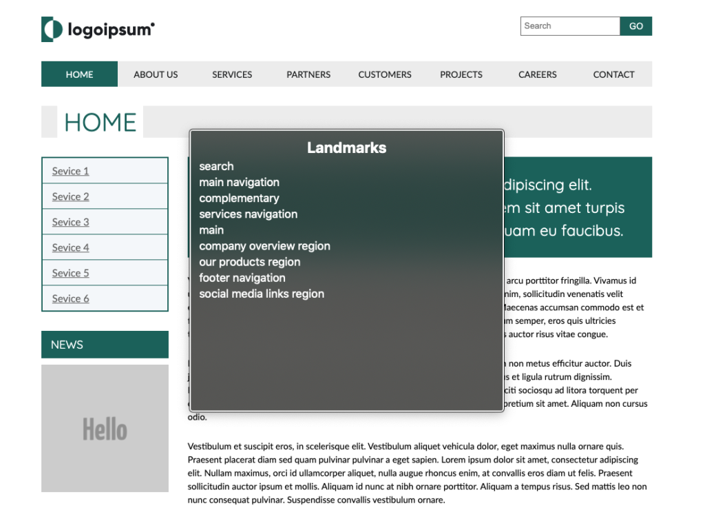
In a nutshell, landmark elements are HTML elements like <main>, <header> and <footer> where their semantics represent areas in the UI layout, or elements such as <section> and <nav> that represents areas in the internal partition in elements.
Screen readers aggregate elements on the page to lists by their type. This feature allows the user to look for landmark elements, for example. If there is a <main> element on the page, it will also appear on the list. The user can choose it on the list and skip right to it, and the same goes for any other element. You will usually find a landmarks list, form controls, headings, and more among these lists. Each screen reader may have a slightly different set of lists, but those that I mentioned can be found on all of them.
There are two benefits to using semantic elements. First, it allows skipping directly to the element, and second, the semantics of the element implies its role in the UI layout.
Using landmark elements for the page layout is significantly helpful in bypassing recurring blocks of content, and helping screen reader users get a clear mental image of the user interface.
In order for the effectiveness of landmark elements in the description of the page layout and content to be maximized, it is worth remembering an important rule of thumb, namely that .
uֹnique elements that describe the page’s general layout, such as <main>, <header> and <aside> do not require a unique accessible name. On the contrary, landmark elements that may have more than one instance on the page, such as <section> and <nav>, should be labeled so that the user can perceive the purpose of each specific instance. There are a few ways to label these elements. The most straightforward one is by adding an “aria-label” attribute with the element name as its value.
Skip-links and proper semantic layout are great foundations and, in most cases, will be everything you need to meet the “bypass blocks” success criterion. However, I want to mention one more method that can help see more options for troubleshooting “bypass blocks” issues. This will also improve page accessibility in general.
You can learn more about screen readers’ elements lists, how to operate them and what else we can learn from them by checking out our previous posts:
Screen Readers 101 For Front End Developers (Mac)
Screen Readers 101 For Front End Developers (Windows)
Headings hierarchy
While landmark elements should represent the page layout, the headings hierarchy reflects its content structure. A good headings hierarchy acts for screen reader users as the page’s table of content.
Screen reader users can use the headings list in the same way we saw with the landmarks list. To some extent, the headings list and the landmark list complement each other in the navigation options they allow, and in the perspective of the interface they provide to the user.
Summary
The bypass block’s success criterion is mainly to address navigation issues, but we have also seen how easy-to-use navigation often depends on the clarity of the content and the layout of the interface. Fixing bypass blocks issues can often be easy wins for the developer and will significantly differ for many users.
I hope that I have been able to move the essence of the bypass blocks success criterion and that the methods I have presented here will help you solve issues in this regard in the future.
Thank you for reading.